After laying the groundwork with widgets in Notification Center with iOS 8, Apple's iOS 10 update makes widgets more accessible and useful by making them available not only on a a device's lock screen, but also on the home screen's Siri search.
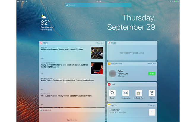
In iOS 10, user-configurable widgets can be accessed from the lock by swiping left. With this change, the iconic "slide to unlock" is officially dead: Apple's lock screen on iOS 10 now says "Press home to unlock."
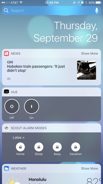
Providing users with some location awareness on screen, the time and date move to the right side of the screen while widgets are displayed below. On an iPhone, this is a single column of widgets that can be completely customized by the user.
Apple's own built-in widgets include the Weather app, "Up Next" from Calendar, Siri App Suggestions, the Apple News app, Find My Friends, and Maps Destinations.
Essentially, with iOS 10, Apple has taken the "Today" screen from the Notification Center and moved it to the lock screen. It's also available by swiping from the left on the home screen, where Siri Search debuted in iOS 9.
As with Siri Search, some widgets feature a "Show More" button, allowing detail to be expanded. For example, Apple's News app normally displays a single story and thumbnail, but tapping "Show More" expands the widget to four stories. iOS 10 remembers a user's preference and will continue to show expanded widgets.
Even while scrolling down the displayed widgets, a search bar remains constantly visible at the top of the screen, both from the lock screen and the home screen.
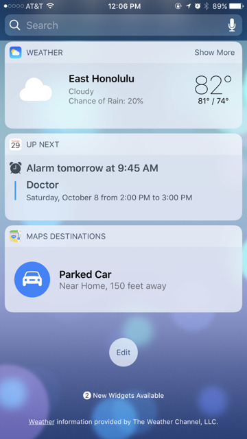
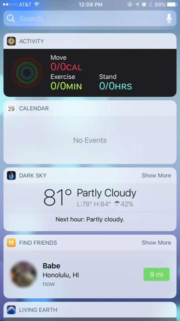
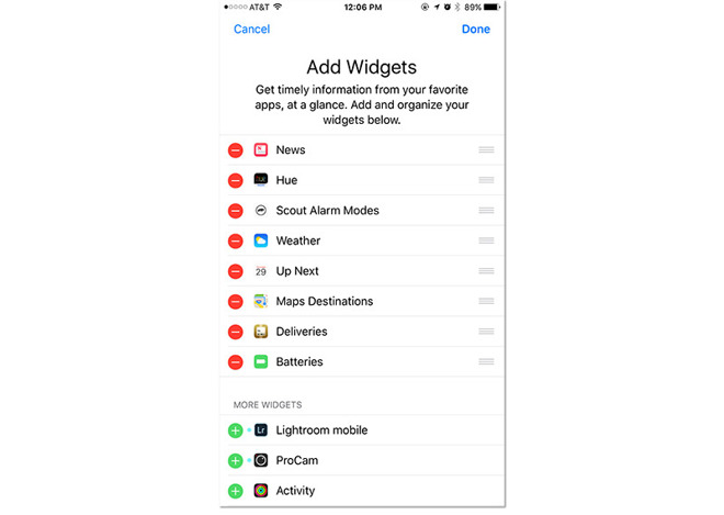
Scrolling all the way to the bottom, users are presented with a circular "Edit" button. Tapping this takes them to an "Add Widgets" screen, where native and compatible third-party apps can be added or removed from the widgets display. Installed apps with widget components are automatically found under the "More Widgets" subsection.
Once widgets are added, they can be reordered by dragging the three horizontal lines located on the row's right side. This works the same as it did in the Notification Center.
iOS 10 also takes advantage of the additional screen real estate found on the iPad, offering two rows of widgets displayed at once. Users can customize both the left and right column displays when adding or removing widgets.
As with iOS 10 on the iPhone, iPad users must also now press the home button to unlock their device.
Finally, iOS 10 has also changed the camera quick access function from the lock screen. Now, users can swipe right anywhere on an iPhone or iPad display to pull over the Camera app from the right side of the screen. Previously, this required swiping upward from the bottom right corner.
Editor's note: This article was originally published in June following Apple's announcement of iOS 10 at WWDC 2016. It has been updated and republished to coincide with the mobile operating system's public release. For more on iOS 10, see AppleInsider's ongoing Inside iOS 10 series.
No comments :
Post a Comment